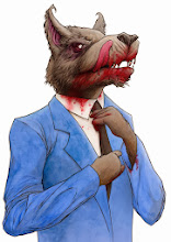
This is my first attempt at the text for this poster and while I like it I think it so too bright and stylised and takes away from the image.
This is the original linework that I did using Illustrator over some hand drawn elements.
The finished poster without any text.


No comments:
Post a Comment